Analyzing 106,090 YikYak posts from my university
First, some background!
Background
YikYak is an anonymous social media app common on college campuses. Even on my own campus, it's done some good. It was very popular between 2013 and 2015, finally shutting down in 2017, mostly due to higher education administrations cracking down on the app - but the rights were sold to Square and resold to another company in 2021. They relaunched in the same year, growing moderate popularity again.
In 2022, a student identified a flaw in the API that returned precise location data for every post (Note: Location was a key part of the app as communities were by geolocation. But the precise coordinates to 15 ft was an issue.)
Finally, in 2023, YikYak was sold to Sidechat (a similar app). They essentially threw away most of the codebase, reskinned Sidechat to look like YikYak, and now dual-list them.
The culture of YikYak is pretty interesting - it's a fully anonymous app on a university campus, so it's conducive to posting about stress, exams, classes, photographs of nature/animals on campus, personal relationship problems, information about events, gossip on the campus's student assembly elections, etc. Generally, unfiltered thoughts by anyone on campus.
Now that you have some context, let me get into how I scraped all 106,090 posts.
var cursor = "";
while (true) {
    let posts = await getPosts(group, cursor);
    if (posts.length === 0) break;
    addPosts(posts);
}
Yes, it really was that simple. Huge shoutout to Micah Lindley, who developed the sidechat.js library I forked to get this to work.
Now that we have all of the posts, let's analyze them. I used the nltk.sentiment.vader library for sentiment analysis, but otherwise, all columns already exist, and I simply shuffled them around (converting UTC to ET, binning to certain time intervals, etc).
Time of day vs frequency
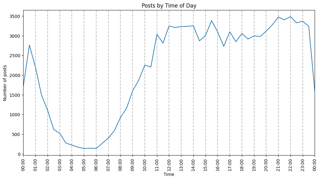
Interesting how late the posts taper down. According to this frequency chart, there's more people posting at 2 AM than 8 AM. Though I suspect there's less people awake at 2 AM, they're just perhaps more likely to post at 2 AM than 8 AM as they would likely be in class.
I also found the bump from 9 PM to 11 PM intriguing. More late-posting, I suppose.
Day vs sentiment
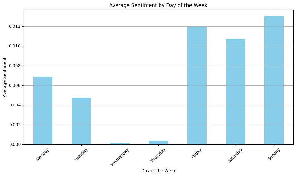
This one is really cool - it shows how Friday, Saturday, and Sunday on average have a high sentiment score. This makes sense - college students love weekends, and Fridays are close enough to qualify.
The drop as the week comes around to Monday and Tuesday makes sense, as well. Though the drop on Wednesday and Thursday is more interesting. Perhaps as the week starts, people are feeling refreshed from the weekend, but by Wednesday and Thursday, they're feeling more tired and stressed.
Time of day vs sentiment
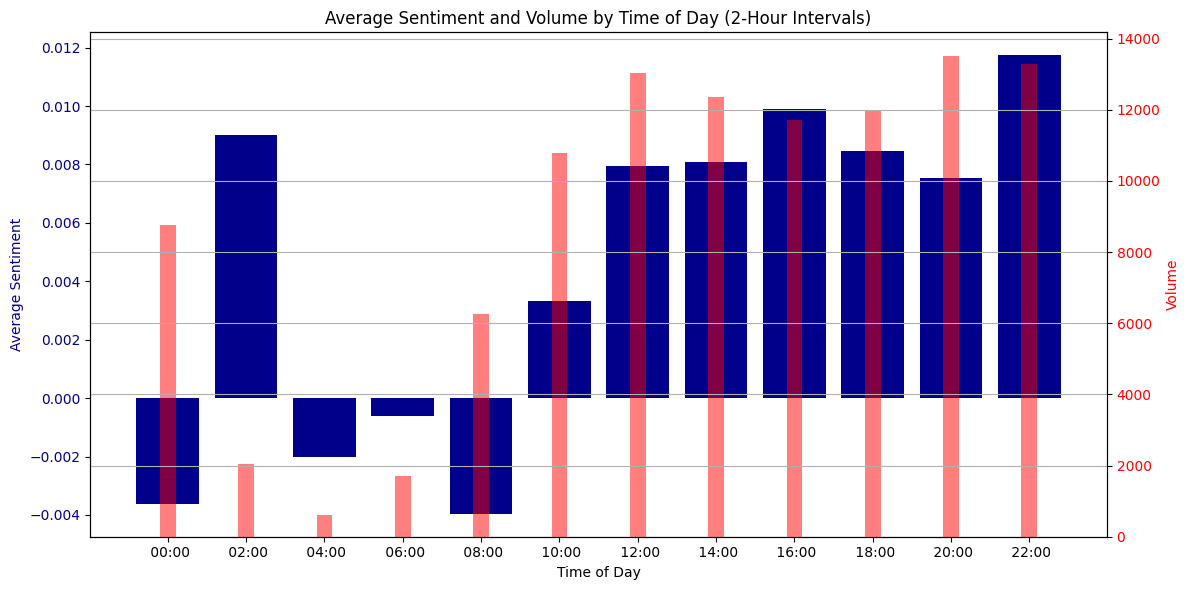
This one is one of my favorites. It charts average sentiment against the time of day it was posted, along with the volume of each interval (to show the variance). The sentiment around midnight is relatively low - almost the lowest of intervals - even with a pretty high sample size. Around 2 AM, the sentiment is relatively high, but the low sample size (as well as the next two intervals) means this data is les reliable.
Interestingly enough, the worst-sentimentality interval is 8 AM. This makes sense to me - university students don't generally like early morning classes and might complain about it on YikYak. As the day continues on, sentiment improves. By 4 PM, there is a higher sentiment score - where many students may be leaving classes. It slightly declines until 8 PM, but the 10 PM interval is the highest interval there is. Perhaps students are happiest at night when they may be doing activities with friends.
Frequency of stress-related words vs exam periods
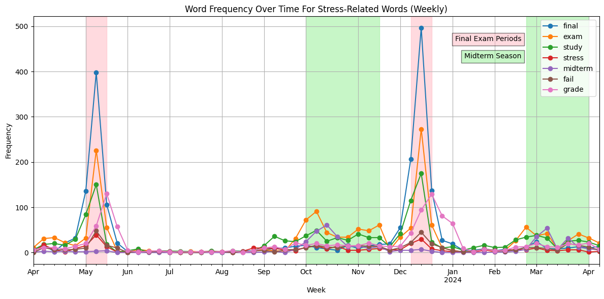
This one is my favorite. It shows how words like "exam", "study", "stress", etc peak during exam periods, as do "midterm" and "final" in their respective periods. Then, immediately following final periods, discussions about "grades" shoot upwards.
Conclusion
I really like doing this kind of analysis, from reverse engineering the API's authentication mechanism, to charting and analyzing the data with Pandas + Jupyter Notebook. It's normal to think, oh, I bet generally people are happier on weekends, but to actually quantify it on a graph is just awesome.